SmartPro Documentation
This document specifies how we can utilize the tools avaliable in Elysium to identify the connected data streams and design dashbaords with the interactive features.
Element Properties
Element is the basic unit of building. It has the following properties.
value
element.value = 10 ;
Contains the value of the element that is dispayed in the screen.
color
element.color = 'red';
Defines the color of the element.
icon
element.icon = 'fas fa-arrow-up';
Sets the icon of the element
isNotify
element.isNotify = true;
Sets the alert state for the element.
width
element.width = '150px'
Sets the width of the element
height
element.height = '150px'
Sets the height of the element
captionWidth
element.captionWidth= '150px'
Sets the Caption Width of the element
valueWidth
element.valueWidth = '60%'
Sets the Width of the element
textAlign
element.textAlign
Defines the text alignment.
Sample Code
            //EXAMPLE 01
          if ( element.value > 70 ) {                 // get the value from element.value
              element.value = 10 ;                 // set the value
              element.color = 'red';               // set the color, color can be name or #00000
              element.icon = 'fas fa-arrow-up';    // set icon
              element.isNotify = true;             // set alert notification indicator
          }
          else {
              //by default icon = 'dot',
              //if you want to remove icon just simply
              element.icon = '';
          }

           //EXAMPLE 02
           // To get other field value of the same packet : newElements['WeightRT']
           // newElements[] is array which contain all new data
           if ( element.value == 'True' ) {       // Check True/False
              element.value = parseInt(newElements['WeightRT']) * 5;
           }

          // layout
          element.width = '150px'         // by default
          element.height = '150px'        // by default
          element.captionWidth = '30%'    // by default
          element.valueWidth = '60%'      // by default
          element.textAlign = 'center'    // by default  'center' / 'bottom' / 'left'/ 'right'
Charts
Using the following syntax, charts can be added to the dashbaord.
Sample Data Set
{
"Plant":"Boiler",
"TimeStamp":"2022/04/22-15:18:54",
"WeightRT":103,
"Packet":"TEST",
"WC_Busy":"False",
"RedyToLogWeight":10,
"Chart": [  { "name":"Page A",
            "uv":676,
            "pv":2400,
            "amt":856 },
          { "name":"Page B",
            "uv":3000,
            "pv":473,
            "amt":502 },
          { "name":"Page C",
            "uv":3000,
            "pv":95,
            "amt":477}
       ],
"PieChart": [ {"name":"Page A","value":566},
           {"name":"Page B","value":564},
           {"name":"Page C","value":254} ]
}
width
element.width = 800
Defines the width attribute of the chart
height
element.height = 300
Defines the height attribute of the chart
isEnableCartesianGrid
element.isEnableCartesianGrid = true
Enables the Cartesian grid in the graph
isLegend
element.isLegend = false
Enables the legend of the graph
legend
element.legend = {
                  layout: "vertical",
                  verticalAlign : "top",
                  align : "right",
                  margin : {top: 20, right: 30, left:20,bottom: 5}
               }
Legend definition
isToolTip
element.isTooltip = false
Enables the tooltip for chart data
xAxis
element.xAxis = { dataKey:"name",interval:0, angle:30, dx:20 }
Line Chart
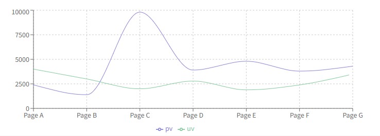
element.lines = [{ type : "monotone", dataKey:"pv", stroke:"#8884d8",dot:true },{ type:"monotone", dataKey:"uv", stroke:"#82ca9d" ,dot:false }]
<LineChart width={730} height={250} data={data}
margin={{ top: 5, right: 30, left: 20, bottom: 5 }}>
<CartesianGrid strokeDasharray="3 3" />
<XAxis dataKey="name" />
<YAxis />
<Tooltip />
<Legend />
<Line type="monotone" dataKey="pv" stroke="#8884d8" />
<Line type="monotone" dataKey="uv" stroke="#82ca9d" />
</LineChart>
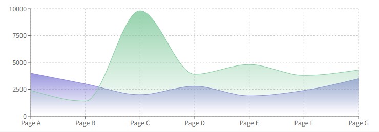
Stacked Area Chart
element.lines = [{ type : "monotone", dataKey:"pv", stroke:"#8884d8",dot:true  },{ type:"monotone", dataKey:"uv", stroke:"#82ca9d" ,dot:false }]

//additional line attributes
fillTopOpacity : 0.8 // default
fillBottomOpacity : 0 // default
fillOpacity : 1 // default by setting fillOpacity = 0 we can hide the fill
strokeWidth : 2 // default , can set the storke width
Pie Chart
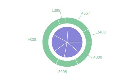
element.lines = [{ dataKey:"pv", fill:"#8884d8" },{ dataKey:"uv", fill:"#82ca9d" }]
<PieChart width={730} height={250}>
<Pie data={data01} dataKey="value" nameKey="name" cx="50%" cy="50%" outerRadius={50} fill="#8884d8" />
<Pie data={data02} dataKey="value" nameKey="name" cx="50%" cy="50%" innerRadius={60} outerRadius={80} fill="#82ca9d" label />
</PieChart>
Bar Chart
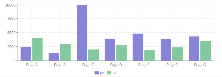
element.lines = [{ dataKey:"pv", stackId:"a",fill:"#8884d8" },{ stackId:"a", dataKey:"uv", fill:"#82ca9d" }]
<BarChart width={730} height={250} data={data}>
<CartesianGrid strokeDasharray="3 3" />
<XAxis dataKey="name" />
<YAxis />
<Tooltip />
<Legend />
<Bar dataKey="pv" fill="#8884d8" />
<Bar dataKey="uv" fill="#82ca9d" />
</BarChart>
Resources
<AreaChart width={730} height={250} data={data}
margin={{ top: 10, right: 30, left: 0, bottom: 0 }}>
<defs>
  <linearGradient id="colorUv" x1="0" y1="0" x2="0" y2="1">
    <stop offset="5%" stopColor="#8884d8" stopOpacity={0.8}/>
    <stop offset="95%" stopColor="#8884d8" stopOpacity={0}/>
  </linearGradient>
  <linearGradient id="colorPv" x1="0" y1="0" x2="0" y2="1">
    <stop offset="5%" stopColor="#82ca9d" stopOpacity={0.8}/>
    <stop offset="95%" stopColor="#82ca9d" stopOpacity={0}/>
  </linearGradient>
</defs>
<XAxis dataKey="name" />
<YAxis />
<CartesianGrid strokeDasharray="3 3" />
<Tooltip />
<Area type="monotone" dataKey="uv" stroke="#8884d8" fillOpacity={1} fill="url(#colorUv)" />
<Area type="monotone" dataKey="pv" stroke="#82ca9d" fillOpacity={1} fill="url(#colorPv)" />
</AreaChart>